Imperial's Logo Concept & Meaning

Concept Behind Logo
Our logo is what we stand for – royal, majestic, and top of the world lifestyle. When you look at the logo, they are simply the initials of Imperial Lifestyle. But there’s more to it.
It also looks like the top of buildings that show what industry we belong in. In short, our logo itself tells you what Imperial Lifestyle will bring to you. There’s also a hidden meaning behind our logo.The logo looks like a crown which denotes the royalty and majestic feel that you get in our properties. Along with that, the logo also looks like the tip of a pen. It means that we’ll always be on point and top of our game to provide the best in the industry.
Meaning Behind The Choice Of Colours
While choosing the colours, we were majorly biased with Golden and Maroon hues. Golden denotes success, and that’s what we want for you. Along with that, the gold colour of the crown also talks about high status and prestige.Maroon is a warm colour surrounding the crown that evokes the feeling of passion, creativity, and at the same time relaxation and beauty. This is what our brand stands for – a complete lifestyle.
Go Top
For Rent
Featured
Condos
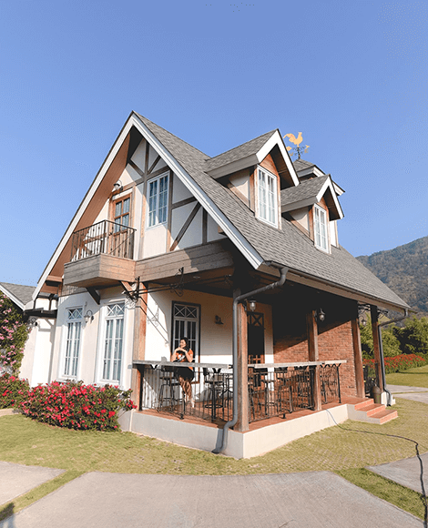
Luxury Condos Infront of the street of Green Park
2305 Tree Frog Lane Overlandpk, MO 66210 ( 100 People Recommended )
$5600 - $8300/mo
Available
- Special Price Get extra 19% off (price inclusive of discount)
- Bank Offer 10% instant discount on VISA Cards
- No cost EMI $49/month. Standard EMI also available
- Rooms: 5
- Beds: 3
- Bathrooms: 2
- Garage: 1
- Area: 1100 Sqft
Description
Bibendum purus aenean mus aenean eu interdum nonummy ipsum ad consequat. Dui eros donec faucibus convallis tempus rutrum id donec mus hymenaeos placerat congue curae mauris turpis gravida viverra consequat consequat gravida luctus.
Highlights:
- Regular Fit.
- Full sleeves.
- Machine wash, tumble dry.

2 Month Ago